Showing posts with label Design. Show all posts

Monday, May 21, 2012

JRPomazon's Scott PIlgrim Tee Shirt Designs vs. The World - Conclusion


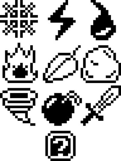
Well, this is something. It's not the grand prize but to be fair I have never gotten this far before with design contests. Seriously, this is sorta amazing. You can actually buy this sucker here: http://www.welovefine.com/2403-sex-bob-omb-icons.html

Thanks to anyone who voted, always appreciated by yours truly.

Thursday, May 10, 2012

Months - March 2012

March 2012
So what we have here is a little something something that will keep me busy for the next few months. I call it months, because calling it anything else would seem like I wanted to make this more complicated than it is.

As I mentioned in my last post, I had a conversation with a friend of mine. He seemed a tad distraught over how our memories begin to compress things more and more as we grow older, recollecting years from only a few moments at a time, remembering decades from the memories of single events. It's inevitable for all of us, we can't expect to remember every little thing that happens in our lives and that's not a losing battle I expect to win. But I decided to make an attempt to catalog my life month by month, noting the experiences I have in a 5 x 5 grid.

So I've been writing down all the things I see, experience, work on and enjoy and making these little layouts. It's a tad personal, so a lot of these won't make too much sense. The sizes of the blocks don't necessarily mean anything, I just use the space that I feel like using for each event or thing. Normally, important events happen to be larger but sometimes I have to settle and make them smaller.

I can't very well post this to websites like DeviantArt or what have you because of the blatant copyright infringement I've committed to make these grids but to be fair the whole thing is an experiment so I'm not too torn up about that bit.

What we have here is March of 2012, the first in my series of month grids that I'll be doling out once a month. I've just started to get April underway and I can only hope May gives me some time to get things in order.

Tuesday, May 1, 2012

Months

I have decided try something interesting for the next couple of months, just something for the hell of it. Documenting the major events of each month as a sort of collage. I'll explain more in detail at a later time, but for now there is this. Post something later this week.


Thursday, April 19, 2012

Scott Pilgrim T-Shirt Designs

Just a reminder that the designs I had submitted to the welovefine.com Scott Pilgrim vs. the World design contest are live and up for voting. Well, they have been for a few days now. Swing on by to the link below and vote if you have a moment to spare: https://www.welovefine.com/contest.php?id_contest=10

Thanks.

Thursday, March 22, 2012

JRPomazon's Scott PIlgrim Tee Shirt Designs vs. The World

Welovefine.com was having a Scott Pilgrim tee shirt design contest, with the celebrity judges and the cash prizes. I couldn't resist. So, I decided to throw caution to the wind and create my own batch of designs. I thought I would continue with the same methods I used for the Wizard of Oz illustration show piece since that turned out well for me. After two weeks of pulling my hair out, gathering materials to use for reference, rereading the comic series, watching the movie, and actually making the designs and planning what kind of shirt to put them on, I finally, finally, finally finished two very fun designs.


The unfortunate thing is that when I went to submit the samples to the website, it seems that the colors got washed out when they decided to put them on their website and now I fear that I'll need to take action in order to secure what chance I had with these designs of winning any sort of mention. But at least, somewhere on this vast sea of electronic aether and magic, these designs are being shown properly and in true color. Wish me luck, I'll be posting/spamming the contest when it begins sometime next month.


Wednesday, November 23, 2011

Re-Purposing: Disassembling a K-Cup

I have considered using junk objects and re-purposing them for other things. It's not something I do all the time nor is it something I broadcast. But I think it would be interesting to see what I can come up with. For this new project, I have decided to take a closer look at the Keurig Coffee Cups and see what I can come up with.

So I heard about these Keurig Coffee machines a while ago, single cup coffee makers that are decently popular at the moment. Almost every bank or business I walk into has one. But I heard there was some issues with these coffee makers because of their coffee containers called K-Cups. Plastic cup that holds inside a coffee filter connected to the walls of the plastic cup with a sticky adhesive and of course the coffee or drink mix sitting in the filter.  I know this because I took one apart.


I ended up using a fork to breach the plastic foil seal on the top, those suckers are AIR TIGHT and probably for good reason. but I was sort of surprised with how it looked inside. For some reason, I didn't expect to see a filter. Sort of stupid to think that in hindsight but I digress. The reason for this "operation" was to see the issue with why it might be difficult to recycle these cups as they are after use. Each piece separately can be placed in the proper recycling outlet but I don't find it likely that people would even bother taking them apart like I did to recycle them. Throwing them away would be much easier than dealing with the headache.

So I have been considering what can be done with these thin walled plastic cups. How could I re purpose them in lieu of just throwing them away and letting them take place in a landfill? Well, with a puncture hole on the bottom from being used for coffee, they can't retain liquids unless the bottom is fixed. (When you place a K-Cup in the machine, it punctures the top and the bottom of the cup to allow water to pass through) I'm considering my options with what the machine has already provided me.

Monday, October 31, 2011

Pinstripe 23 - Threadless

So I thought I would try to give threadless another shot and I decided to work with an earlier design from the summer. If you look back a little,  you might see that 23 on a pair of headphones that made it all the way to the final stages of the Skullcandy Aviator headphone competition last summer. I wanted to see what I could do with the design and so I ended up making this. It's currently up for votes and if you happen to have a moment to spare, any positive input would be greatly appreciated. 
Follow this link to see.

As for other work, especially my on going series and projects like the "Plastic Beach" images, well to be honest I have done little to nothing with those. It's not that I have forgotten they are there, it's just that I've begun to lose motivation to bother with them. It's a shame really, because I was hoping to have these images completed one year ago. Despite certain personal setbacks, I'll at least finish most of them . . . if not all.

Sunday, December 12, 2010

Art/Design needs to Evolve

Evolve used for lack a better term. And for the record, this isn't a critical analysis of art today, this is merely the realization of what has to happen in order to make successful artwork. So I had a thought as I was in the bathroom this afternoon (what I may have been doing in there is none of your damn business you filthy perverts). It was about surfing of all things, like with a surfboard on an ocean. Shuffling through what little I knew about surfing, my thoughts eventually went to the Graphic Designer and personal favorite, David Carson. For those who don't know Carson, have a looksee below:


I recommend anyone who hasn't seen anything like this before look Carson up. Anyway, Carson did the designs for a now defunct magazine called "Beach Culture" which focused on surfing and other ocean related hobbies in California. Carson himself was an avid surfer in his younger days and might even be so today. But I digress, I need to prove a point. Carson did design work but he also included other passions in his life into his work. The chaotic and almost illegible type relating to the uncertain and liquid state of a tidal wave, or the brashness of youth coming through without a care in the world.

Now, this is just an interpretation of Carson's work, I'm sure he'd probably read this and tell me that I was insane. But art/ design alone doesn't work by itself, it's a piece of a final product. What you combine with art /design is the real interesting element. This isn't some revolutionary concept I'm talking about, plenty of people have come to their own understandings about this subject. But there are some people, mostly young aspiring artists and designers who think that if they work with the basic ideas of art/design alone, they'll be fine and the creativity from these sources alone will be enough. To be blunt, beef stew isn't beef stew with just beef. Beef stew with just beef brings grief.

We need more artists who can push the boundaries of their work by adding more into it. In the future, I don't want to see art that is just art. I want to see art that is a flurry of spices and seasonings all mixed together into their work. I want to see a painting, a portrait with the artist's love of soccer, their admiration for Russian Propaganda, their disgust of fast food, all coming in at once and turning an elementary example of art into something great. Of course, I am not proposing we make chimerical artwork, merely the sum parts of the influences used to create it. In that respect, it might seem easy to make a Frankenstein monster out of art. Cheap and lifeless are not goals I wish people to undertake. You still need beef to make beef stew after all, so use the spices sparingly and appropriately.

Being a student at an art school, I have been graced to see many talented artists' works hung on the white walls that cover the school and there have been a lot of different directions that these people have gone. But there is still more we can do. So that is why I say art/design needs to evolve. Even though design is less based on the personal expressions of the designer and more about problem solving, there is still a personal element that can be thrown into how to solve a problem if not the creation of the design.

So that's my rant, like I said before it's nothing new. It's just something I think that needs to be said.

Friday, July 23, 2010

Sweepstakes


And here we have another completed addition to the Plastic Beach series, I present to you: Sweepstakes. After hearing all the various noises and sounds that are featured in the song, my mind created a sort of image that is created with several parts acting as one. This is much like the same logic used to create Some Kind Of Nature, multiple pieces acting together. I have thought to present this piece much like that of my Speech series, incorporating various layers, one over the other, to create a full image.

I also thought about the idea of a Sweepstakes acting sort of like an analogy for life and death, which is why I placed the skull in the middle. When we die, is it like our number has been drawn and we run on up to the front? Is death the ultimate prize we wait and wait to win in life or perhaps is there something after all that? Clearly you can imagine that my musings of life and the afterlife have heavily inspired this idea for Sweepstakes.

Unlike the other pieces, which have been graffiti/grunge, I decided to go with something a little more precise and cleaned up, although it carries that same chaotic theme with the repetition of numbers and lines. I've been told it resembles the designs of the 90's film, The Matrix, and I suppose they have a point. With the numbers, the greens, the transparent digital appeal. It's sort of odd that it turned out that way to be honest, I was thinking of doing this piece as an old stock ticker rather than an analog clock. Although I have to say I am happy that I chose the clock over the ticker.

Another influence for this piece is the concrete poetry of Ferdinand Kriwet, whose work I discovered in y Design Stories class last year. That is what inspired the circle of numbers floating out in the middle of the piece, a sort of rhythm and repetition that creatures the illusion of motion. I'll show you a sample of his work below:


This makes 5 out of 15 down! It's been a long way from March when I started all this but I'm finally a third done! Sweepstakes definately help break up some of the mental barriers in my head and I've concocted new ideas for the remainder of the series. I should be able to make at least one more piece for Plastic Beach by the end of the summer.

Friday, April 2, 2010

Let's talk about Icons

I remember learning about icons a while back in freshman year, when the graphic design classes were tutorials and exercises into learning CS3 Illustrator and InDesign. There was this one assignment we did back then, involving the creation of a set of icons. I was fond of pixel bases art, and ended up making these 8-bit like designs.

Not the most fascinating things I ever made and they received a good amount of criticism. And yes, they are heavily based off of Mega Man Weapon sprites. I gave myself too many restrictions and ended up making this assignments more horrible than it had to be, which then turned off my interest in the little buggers. However, I recently found a page filled with Icons while looking for a specific photoshop tutorial and I have to say, I'm willing to give icons another go.


A name that comes to mind is Ryan McGuiness, an artist I discovered some time ago before I began to formally attend college and one of the inspirations that lead me to choose design as a major. Colorful icons and images that he would use a smaller details in a larger piece. In other words, a bunch of tiny icons and all the meanings they have forming an even larger icon as little ornaments.

It also reminds me of some of the pins from the video game "The World Ends With You." (also known in Japan as "It's a Wonderful Life", the name changed for obvious reasons) Each of the pins are used as means to preform certain attacks to the game while also a part of the trend setting feature used in the game. I won't go into the game's mechanics or anything, I would warn you if this was going to be a game review. I can tell you however from experience that it is one of the better Japanese RPGs out there. Anyway, the pins themselves share that same kind of colorful poppy-ness that I find so appealing in icons. Simple images, both abstract and figurative from sunshine rainbows to down to concrete grunge. The variety is VERY amusing.

So what do I have to say about icons personally? I find them very compelling. Portraying an idea without using more than a couple lines or shapes isn't something anyone can do and I think the process is a tad bit underrated. That being said, I think I could incorporate icons in my work more than I already do.

For good examples of Icons click here

For some more The World Ends With You pins click here

Thursday, March 25, 2010

The Plastic Beach Series - Empire Ants and Future Additions


I recently finished the second addition the the Plastic Beach series with "Empire Ants - Marching On."  Please pardon the watermark.

A LOT of tracing done here. The giant ant that was used as a mask with the W11-2 sign characters used in repetition where all outlined and turned into vectors that I made much use of. I made different variations to the same image to be used in a repeating series.

The song itself comments on how society moves on with it's routines like ants marching on (hence the the secondary title). But I interpreted from the lyrics that the song is saying as individuals, we have the choice to free ourselves from routines society places on us. It all depends whether or not you have the courage to leave behind the security of a daily regimen and jump into whatever.

Speaking of marching on, this makes 2/15 pieces done for the series! Still a long way to go, but I think I can finish it. Although trying to make each piece not too similar is rather trying, in fact I might have already failed. Either way, I have high hopes for the remaining pieces. Currently drafting "Melancholy Hill" and "Rhinestone Eyes", but the ideas are very illustration heavy (not my strongest suit, I'm still quite amateur when it comes to drawing things on the realistic or biologically correct side). I'm also thinking of using photography for some of the other pictures, but I fear that might come off as a more minimalist approach.

Plastic Beach aside, the Speech series might be getting a new addition in the near future. Been working with people like Ghandi and Mother Teresa, but I think it's time to try someone outside the lines of advocate for peace.

Saturday, March 13, 2010

Current Ideas and Project

Over the past couple of years, it seems that there have been several times when I tend to unknowingly create a series of images. It wasn't until recently that I felt that any of that work was worth showing off.

And Asterisk
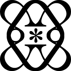
My first attempt in abstract typographic work from last year. I used the characters "*" and "&" to create these images, which explains the title of this series. Using the Baskerville font gave these images a sort of elegant look with the serifs on the characters. These images came off to me as some sort of abstract baroque style, with their simplistic yet graceful appearance.
And Asterisk - Emblem


Plastic Beach

With the recent release of the Gorillaz newest album "Plastic Beach" (which I will address later on in this blog), I've been completely caught up in some sort of (for lack of a better term) "Gorillaz fever." That being said, their music has begun to inspire me to do a series based off the songs on the album. The example shown here is for their single "Stylo". I'd prefer to make them so they didn't look too similar to each other, or seem like a direct translation from the song lyrics. These works will be seen in the near future in this blog.
Stylo - Yippee Ki Yay

Speech


Another recent series that I have been playing with. The idea I want to explain is that people live on in their words. The example I show from this series is one of Martin Luther King Dr. whose image is constructed from the words of his public speech "I Have a Dream" from 1963. The shaded letters on the color background form the image. This particular series has received a decent amount of praise, although getting the image and the speech featured to work together isn't always a walk in the park. I'm looking forward to continuing these series.
Dream


Please visit my DeviantArt page if you want to see better quality versions of these images and their respected series. And my apologies for any personal rage you might experience by dealing with DeviantArt.