Showing posts with label Icons. Show all posts
Monday, May 21, 2012
JRPomazon's Scott PIlgrim Tee Shirt Designs vs. The World - Conclusion
Well, this is something. It's not the grand prize but to be fair I have never gotten this far before with design contests. Seriously, this is sorta amazing. You can actually buy this sucker here: http://www.welovefine.com/2403-sex-bob-omb-icons.html
Thanks to anyone who voted, always appreciated by yours truly.
Thursday, March 22, 2012
JRPomazon's Scott PIlgrim Tee Shirt Designs vs. The World
Welovefine.com was having a Scott Pilgrim tee shirt design contest, with the celebrity judges and the cash prizes. I couldn't resist. So, I decided to throw caution to the wind and create my own batch of designs. I thought I would continue with the same methods I used for the Wizard of Oz illustration show piece since that turned out well for me. After two weeks of pulling my hair out, gathering materials to use for reference, rereading the comic series, watching the movie, and actually making the designs and planning what kind of shirt to put them on, I finally, finally, finally finished two very fun designs.
The unfortunate thing is that when I went to submit the samples to the website, it seems that the colors got washed out when they decided to put them on their website and now I fear that I'll need to take action in order to secure what chance I had with these designs of winning any sort of mention. But at least, somewhere on this vast sea of electronic aether and magic, these designs are being shown properly and in true color. Wish me luck, I'll be posting/spamming the contest when it begins sometime next month.
Wednesday, September 7, 2011
Vital Signs - Logo and Type
So I haven't bothered to really get to updating this blog for a while. I hope to get back into the habit of posting things here and make myself a stronger presence online.
I was asked to do a logo for my sister's acapella group down in Elon University. Here is what I came up with for them:
It got relatively positive reviews from the group members and my sister, so I guess that makes this a job well done.
I was asked to do a logo for my sister's acapella group down in Elon University. Here is what I came up with for them:
It got relatively positive reviews from the group members and my sister, so I guess that makes this a job well done.
Friday, April 2, 2010
Let's talk about Icons
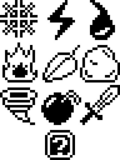
I remember learning about icons a while back in freshman year, when the graphic design classes were tutorials and exercises into learning CS3 Illustrator and InDesign. There was this one assignment we did back then, involving the creation of a set of icons. I was fond of pixel bases art, and ended up making these 8-bit like designs.
Not the most fascinating things I ever made and they received a good amount of criticism. And yes, they are heavily based off of Mega Man Weapon sprites. I gave myself too many restrictions and ended up making this assignments more horrible than it had to be, which then turned off my interest in the little buggers. However, I recently found a page filled with Icons while looking for a specific photoshop tutorial and I have to say, I'm willing to give icons another go.
A name that comes to mind is Ryan McGuiness, an artist I discovered some time ago before I began to formally attend college and one of the inspirations that lead me to choose design as a major. Colorful icons and images that he would use a smaller details in a larger piece. In other words, a bunch of tiny icons and all the meanings they have forming an even larger icon as little ornaments.
It also reminds me of some of the pins from the video game "The World Ends With You." (also known in Japan as "It's a Wonderful Life", the name changed for obvious reasons) Each of the pins are used as means to preform certain attacks to the game while also a part of the trend setting feature used in the game. I won't go into the game's mechanics or anything, I would warn you if this was going to be a game review. I can tell you however from experience that it is one of the better Japanese RPGs out there. Anyway, the pins themselves share that same kind of colorful poppy-ness that I find so appealing in icons. Simple images, both abstract and figurative from sunshine rainbows to down to concrete grunge. The variety is VERY amusing.
So what do I have to say about icons personally? I find them very compelling. Portraying an idea without using more than a couple lines or shapes isn't something anyone can do and I think the process is a tad bit underrated. That being said, I think I could incorporate icons in my work more than I already do.
For good examples of Icons click here
For some more The World Ends With You pins click here
So what do I have to say about icons personally? I find them very compelling. Portraying an idea without using more than a couple lines or shapes isn't something anyone can do and I think the process is a tad bit underrated. That being said, I think I could incorporate icons in my work more than I already do.
For good examples of Icons click here
For some more The World Ends With You pins click here
Subscribe to:
Posts (Atom)