So I re-read the last post I made on this blog and I came to the conclusion that I am not one who should broadcast what I think has to happen to the art world as a whole. Or anything remotely similar to this. It might be interesting to see a different view point, but seriously I should just stop while I'm ahead. It all sounds rather pretentious honestly. Or worse yet, trying to sound much more intelligent then I really am and that is just stupid to begin with.
The same thing can be said when I do segments about music, albums and what have you. But I feel as though my opinions to music as much less authoritative and more about perspective which in turn makes them seem less troublesome. Either way, I have to be sure not to sound like some whiny little bitch who thinks he knows everything. Because ladies and gentlemen, I don't. In fact, the only thing that I seem to discover periodically is how little I know about most things. And that's demeaning and depressing, but also sort of inspiring.
So I guess that is all for now, not really in a mood to post anything new or exciting since the semester has ended, but it's all about keeping the ball rolling. Have a happy new year, whoever and wherever you are.
Friday, December 31, 2010
Sunday, December 12, 2010
Art/Design needs to Evolve
Evolve used for lack a better term. And for the record, this isn't a critical analysis of art today, this is merely the realization of what has to happen in order to make successful artwork. So I had a thought as I was in the bathroom this afternoon (what I may have been doing in there is none of your damn business you filthy perverts). It was about surfing of all things, like with a surfboard on an ocean. Shuffling through what little I knew about surfing, my thoughts eventually went to the Graphic Designer and personal favorite, David Carson. For those who don't know Carson, have a looksee below:


I recommend anyone who hasn't seen anything like this before look Carson up. Anyway, Carson did the designs for a now defunct magazine called "Beach Culture" which focused on surfing and other ocean related hobbies in California. Carson himself was an avid surfer in his younger days and might even be so today. But I digress, I need to prove a point. Carson did design work but he also included other passions in his life into his work. The chaotic and almost illegible type relating to the uncertain and liquid state of a tidal wave, or the brashness of youth coming through without a care in the world.
Now, this is just an interpretation of Carson's work, I'm sure he'd probably read this and tell me that I was insane. But art/ design alone doesn't work by itself, it's a piece of a final product. What you combine with art /design is the real interesting element. This isn't some revolutionary concept I'm talking about, plenty of people have come to their own understandings about this subject. But there are some people, mostly young aspiring artists and designers who think that if they work with the basic ideas of art/design alone, they'll be fine and the creativity from these sources alone will be enough. To be blunt, beef stew isn't beef stew with just beef. Beef stew with just beef brings grief.
We need more artists who can push the boundaries of their work by adding more into it. In the future, I don't want to see art that is just art. I want to see art that is a flurry of spices and seasonings all mixed together into their work. I want to see a painting, a portrait with the artist's love of soccer, their admiration for Russian Propaganda, their disgust of fast food, all coming in at once and turning an elementary example of art into something great. Of course, I am not proposing we make chimerical artwork, merely the sum parts of the influences used to create it. In that respect, it might seem easy to make a Frankenstein monster out of art. Cheap and lifeless are not goals I wish people to undertake. You still need beef to make beef stew after all, so use the spices sparingly and appropriately.
Being a student at an art school, I have been graced to see many talented artists' works hung on the white walls that cover the school and there have been a lot of different directions that these people have gone. But there is still more we can do. So that is why I say art/design needs to evolve. Even though design is less based on the personal expressions of the designer and more about problem solving, there is still a personal element that can be thrown into how to solve a problem if not the creation of the design.
So that's my rant, like I said before it's nothing new. It's just something I think that needs to be said.
Monday, December 6, 2010
We're Not Kidding Around
 “Don’t Kid Yourself"
 “We’re Not Kidding Ourselves Here”
I have more work finished up, but these are the only ones with set titles. Hoping to go ahead and add more very soon.
These recent pictures are all playing on different effects and visuals that hope to expand on these very 2-D creations from the limbo of potential t-shirt designs (all of course without taking their charming simplicity from them too much). Playing with certain colors gave these stencil figures a sense of depth, using non-stencil photographic images much like that of the Leslie Nielson image in the last post, the gradients helped expand environments rather than using simple flat colors and the use of blurring to also show depth. I should keep effects to a minimum, like I said I want to keep them simplistic to a degree.
These recent pictures are all playing on different effects and visuals that hope to expand on these very 2-D creations from the limbo of potential t-shirt designs (all of course without taking their charming simplicity from them too much). Playing with certain colors gave these stencil figures a sense of depth, using non-stencil photographic images much like that of the Leslie Nielson image in the last post, the gradients helped expand environments rather than using simple flat colors and the use of blurring to also show depth. I should keep effects to a minimum, like I said I want to keep them simplistic to a degree.
Monday, November 29, 2010
History Repeats Itself
"History repeats itself, the first time as tragedy and the second time as farce."
Seminar update, nothing too large. Also:
 Leslie Nielson
1926-2010
Seminar update, nothing too large. Also:
Leslie Nielson1926-2010
Tuesday, November 23, 2010
Cloud of Unknowing
 You'll have to pardon the watermark, but I'd feel better knowing that the clean version of this image wasn't on the internet.
Another addition to the Plastic Beach series I started in March, using the song "Cloud of Unknowing" by Gorillaz. I haven't completely forgotten about it, it's just been difficult to make the images I want with the skills I have, so it's been finding compromises.
I saw Gorillaz live in concert the other month and during the show I got to see a lot of visualizations for the different songs they played. Luckily for me, there was a lot of their new stuff during the show and that helped me figure out what I could do for the songs. Cloud of Unknowing has been a favorite on the new album, Bobby Womack's vocals really capture a melancholy that's just absolutely perfect for the sound with slow strings ensemble.
The visualizations at the concert was WW2 footage, planes crashing and falling into the sea. It was powerful stuff and helped me figure out how to finish this particular image which I have made with samples of photos I have taken of the sky from here in the US to some taken this summer during my trip to Japan.
You can see the visuals here: http://www.youtube.com/watch?v=S02Sb_KnndQ
I do have a few shots from the concert, although to be honest many of them aren't worth noting. Blurry color a good picture does not make. I'll have to post the few good ones up later. With this piece done, that leaves the total remaining to 8. Not only under 10, but even too. Hoping to finish this series up before we reach the one year anniversary of starting it.
Friday, November 19, 2010
Embarrassingly Predictable

"It’s embarrassingly pat and predictable."
So I managed to get something done, but it's going to be some time before I get the chance to finish anything else to this extent. Looks good if you ask me. It's all well and good to have all this work done, but I have to tackle how I am going to present all this work. Quite the conundrum at this time, need to settle that out. Here's to progress.
Thursday, November 18, 2010
We have troubles wrench monkeys
I'm unfortunately going to have to report that there might be a hold up with some of my incoming art for a few days due to technical difficulties concerning computers and the like. Without worrying you all (4 people?), this doesn't mean a total stop in progress, just a slightly total stop. If that makes sense to you that makes one of us. No album reviews or rants this time, not even the damn model either. Stick around, I'll get off my ass and take care of business later.
-Jordan
-Jordan
Saturday, November 13, 2010
No Shame in Exploiting . . .

"There is no shame in exploiting the weakness of your enemy"
More work coming soon.
More work coming soon.
Wednesday, November 10, 2010
WHAT DOES IT MEAN? and other things
 Inspired by the recent internet sensation "Double Rainbow" and the phrase "What Does This Mean?" Lucky for me, it incorporates what I'm working with for seminar. It feels like I'm getting away with having fun with work. Strange thing.
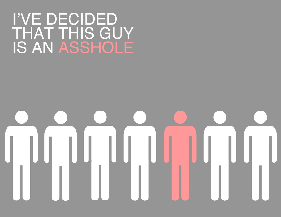 I made some alterations to Asshole for Today, removed some type and cleaned the graphics. It's much more straight to the point now.
I'm hoping to keep up the pace with my work, although other aspects of life might get in the way (as they always seem to do). I also want to get working on the model as well, I'm hoping to finish that kit up by the end of the year if I get the chance. Well, so far so good.
Monday, November 1, 2010
Asshole For Today

I think I’ve managed to find something I’m decently comfortable with. The thought used was an after thought of mind that I decided to record, I think I used it well.
What is gnawing at the back of my skull is whether or not the simplistic minimalist approach is something I want to do. I like how it’s blunt but I feel people are going to bash my work for being half-assed. Could it have more? Most likely but it doesn’t necessarily need more, if it ain’t broke then don’t fix it. Regardless, I want to see how much more I can do in this style and with these W11 sign characters.
As for scouring the newspapers for negativity and everything else, it’s all on the way.
Saturday, October 30, 2010
Thought Work

“People don’t change, they only lie to themselves until they start believing they have”
So my seminar work focuses on taking thoughts, comments and what have you and making images based from those ideas. This is one of these pieces. The image is very simplistic, but when combined with the idea it stirs up thought. I like the direction I'm taking with this, despite the overwhelming negativity involved. Much more on the way.
Wednesday, October 13, 2010
Things I've learned about John Updike's Writing
I'm somewhat familiar with John Updike's short stories and a novel of his called "Rabbit Run", so I think I'm finally at that point where I can make critical assessments on his style and things he likes to throw in his writing. This is strange and new because this is written word I'm talking about and I've never been that avid a reader despite the creative writing minor I've been striving for the past 3 years to obtain. Isn't that funny?
Updike's descriptions are incredible. This man would take the most mundane objects and scenes and describe them so vividly that you could envision it perfectly in your mind. He wrote a short story called "A&P" that takes place in a grocery store. He describes each aisle, and not just how it looks. What are on the shelves, what those things look like, what they do, why they are there, he writes these descriptions so wonderfully. He doesn't miss a single detail AND (and this is a big AND) he writes them down in a way that doesn't bore you. Not always areas and places, but also mindsets, what the protagonist maybe thinking, thoughts so common we might have thought them ourselves. Good in smaller increments, but dangerous in some of his longer novels. In "Rabbit Run" it would feel like entire sections of the book are nothing more than descriptions and that is something that is easy to get overwhelmed by. 3 pages about one old lady's flower garden is enough thank you.
Updike's Protagonists are assholes. Every single character that we have the pleasure of having the perspective of (from what I've read) is someone who is just a total jerk and more times than not, their own worst enemy. Back to "Rabbit Run", the man (Harry Angstrom) gets fed up with his family (pregnant wife and son) and decides to leave home to better his own life because he is unhappy. Yes, why don't we all throw our responsibilities to the wind and do whatever the hell we want? And that is only the beginning, he constantly tries to leave but then finds himself coming back over and over again throughout the course of the book, for one reason or another. Guess what he ends up doing again at the end of the book? We'll get to that later.
In the short story "Seperating" Updike has the main character Richard, a man going through a seperation with his wife who have to break it to their family. At first, he seems shaken by the entire ordeal and we begin to feel some sort of sympathy for him only to realize later one that the one who wanted the separation was in fact him. So this entire time we have the guy painted and gussied up to be the paragon of fatherhood only to find out that he is far from it, that he is in fact human as well.
Updike's Protagonists never accomplish anything. It's like no matter what these characters go through, no matter how challenging or rewarding the hardships are they just don't learn anything from their experiences or their mistakes. Harry Angstrom keeps on running over and over and at the end of the story guess what? He is still running away, selfishly trying to make his life better as he forsakes everything else. Over the course of the sequels to this story, there is some progress made by this character so not all hope is lost. Then we have the Richard from "Separating." He wants to break off the relationship with his wife, they don't even enjoy each others company anymore. And why does he want to do this? When confronted by his son at the end of the story who asks the simple question "why?" he doesn't have an answer. HE DOESN'T EVEN REMEMBER THE REASON ANYMORE. Why all the stress? Why all the tears? He doesn't even know why or what he is doing.
And finally we have the young man from "A&P", who has his eye on a lovely lady in a bikini who happens to walk into the store one day and goes as far to quit his job in hopes of impressing her after his manager kicks her out for the sake of public decency. His mind set akin to "Hey, if I support her poor decision to wear minimal clothing in public can I get in her pants?" Does this brash and bold move get the girl in the end? Worked as well as a screen door on a submarine and our hero is unemployed. Way to be champ.
The women Updike writes are cold. Almost all the girls I've seen this man write seem so unfeeling and judgmental as all the men he writes seem to be so passionate about everything. This is a common formula for his cast of characters, best illustrated in "Seperating". We have the father and the sons acting very emotionally about the entire separation while the girls are general complacent about the whole thing. No real remarks to make, no protests or anything, complete acceptance of the facts presented to them. They are nearly impossible to get behind as characters because of this, which helps readers relate to the often male protagonists he places in these types of events.
Now, I find Updike's writing to be a pleasure most times to read, but sometimes it can feel overwhelming, especially with novels. I enjoy his short stories, much more compact and compressed for my liking. Long story short, the man knows how to write and that is the important thing. But if you need to know anything about any of his works, the points above will pretty much tell you the basics.
Sunday, October 10, 2010
Album Review(s): Spring Heeled Jack U.S.A. and Amy MacDonald
So I have only a couple of albums I wish to rate for your viewing pleasure this evening. Didn't get the chance to evaluate more than this, the others I'm still feeling more inconclusive about at this time.
Spring Heeled Jack U.S.A. - Songs From Suburbia
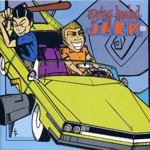 Rating: Rambunctious/ Happy - 3.5/4.0
We have here some fine work from the third wave ska revival of the 1990's that gave bands such as the Mighty Mighty Bosstones and No Doubt their big starts. This is the sophomore album of the group, which is their best work. The album starts off good and builds up quickly, but some of the song placements in the album I'd say could have been better. The beginning gets quick and loud fast, then gets more mellow by the end of it which seems like kind of a bummer for a ska album. Now granted, it wasn't too bad but the last few tracks were beginning to lose me till "Morning Sun" came on. In my opinion, the ending for this genres should be much more tremendous and loud.
It's very catchy, the songs have good lyrics and the singer doesn't repulse me like some ska bands like Less Than Jake. Tracks like Jolene and MCMLIX (1959) are absolutely wonderful, especially the 1959. The song is about how the baby boom generation wasn't quite as innocent as our parents so often lead us to believe. Other notable tracks include Beggin' and Time.
Amy MacDonald - This Is The Life
 Rating: Earnest/Emotional - 4.0/4.5
The debut album of the Scottish singer/songwriter Amy MacDonald, entering charts at number 2. Not too bad for a first time, even though it's been a few years since the album was released she's had 6 singles in the UK (one being a re-release). MacDonald has quite a lovely voice, which adapts with the various speeds the the album's songs. I also have to give props to the band in the background, they really complement her very well. That's right, it's a folk album that isn't all slow songs about reflection and affection. It's good music to listen to when you just want to relax and that is always appreciated by yours truly.
The songs focus on things most people can find themselves relating too, whether it's melancholy or nostalgia with enough emotion in the lyrics for everyone. Tracks I'd recommend are This Is The Life, Poison Prince, Let's Start a Band and Barrowland Ballroom.
Spring Heeled Jack U.S.A. - Songs From Suburbia
Rating: Rambunctious/ Happy - 3.5/4.0We have here some fine work from the third wave ska revival of the 1990's that gave bands such as the Mighty Mighty Bosstones and No Doubt their big starts. This is the sophomore album of the group, which is their best work. The album starts off good and builds up quickly, but some of the song placements in the album I'd say could have been better. The beginning gets quick and loud fast, then gets more mellow by the end of it which seems like kind of a bummer for a ska album. Now granted, it wasn't too bad but the last few tracks were beginning to lose me till "Morning Sun" came on. In my opinion, the ending for this genres should be much more tremendous and loud.
It's very catchy, the songs have good lyrics and the singer doesn't repulse me like some ska bands like Less Than Jake. Tracks like Jolene and MCMLIX (1959) are absolutely wonderful, especially the 1959. The song is about how the baby boom generation wasn't quite as innocent as our parents so often lead us to believe. Other notable tracks include Beggin' and Time.
Amy MacDonald - This Is The Life
Rating: Earnest/Emotional - 4.0/4.5The debut album of the Scottish singer/songwriter Amy MacDonald, entering charts at number 2. Not too bad for a first time, even though it's been a few years since the album was released she's had 6 singles in the UK (one being a re-release). MacDonald has quite a lovely voice, which adapts with the various speeds the the album's songs. I also have to give props to the band in the background, they really complement her very well. That's right, it's a folk album that isn't all slow songs about reflection and affection. It's good music to listen to when you just want to relax and that is always appreciated by yours truly.
The songs focus on things most people can find themselves relating too, whether it's melancholy or nostalgia with enough emotion in the lyrics for everyone. Tracks I'd recommend are This Is The Life, Poison Prince, Let's Start a Band and Barrowland Ballroom.
Friday, October 8, 2010
I don't post here nearly enough: New Projects fo Seminar
So I haven't posted about art in Months. Yeah, I've been really good at keeping this blog, no wonder no one reads this. Anyway, I'm here in the wee hours of the morning to hopefully fix that. Allow me to elaborate on what the hell I'm supposedly doing these days.
Taken from my seminar blog: http://jmcvey.net/sylva/
* * *
Taken from my seminar blog: http://jmcvey.net/sylva/
* * *
“Legos”
I’m going to call this methods “Legos” for the time being, it’s catchy enough. The original sketches for this project involved various block shapes stacked up on top of each other, slowly becoming more distant from each other vertically. To give you a visual in lieu of the obvious lack of photography, it’s like falling tetris blocks. The idea was to take actual legos or perhaps pieces of wood and glue them to a large acrylic board to give it that “free floating” appeal. Unfortunately, this does not seem all that likely. It might be possible to make the image digitally, print it on vellum and have the semi-transparent appeal work for what it was worth, but that might seem a tad boring.
Then I started working with actual legos and then this train wreck started to look half decent. Markus Raetz did a sculpture that was the word “YES” from one perspective. When turned around, the shapes realigned and made the word “NO.” I am rather taken with the playful nature of many of his works, so I tried to do something like it without attempting to completely rip off his work. So far, I haven’t had a much luck as I would have hoped. There is only so much I can do with lego blocks. I shouldn’t try to make a transition piece since it would too close to the original piece I’m basing this on, I prefer not have seen as a rip off. At least, not right away. I have been contemplating moving up to Duplo or perhaps actual pieces of lumber.

“Speech”
And here we have yet another idea that I have been playing with for some time now since early last March, perhaps even earlier than that. Taking “speech” or perhaps a large amount of letters and words and having the letters act as small fragments of an image as they are shaded differently. The finished image is made up of various different sheets that all together make the image, much like an old animation cel. I’ve made pieces like this before, so I know there is a larger success rate for this approach. However, the trick for this one is making sure I’m doing something new rather than what I have been doing. I have been considering making it into a sort of assembly, bringing the flat image out to at a 2-D perspective. This would require thin mounting board, preferably something I can cut into without too much trouble. That particular approach to this method might be a tad pretentious of me, I’m still playing around with it. It’s very similar to Christopher Burnett’s “Sprawlcode”, which takes what I’ve done a step further by having each letter or character have it’s own individual color, which I believe is at least possible for me to attempt. Whether or not it’s even nessessary has yet to be decided. Here is the second “Speech” piece I made with Martin Luther King Jr.’s “I Have a Dream” speech. (Please pardon the watermark on the image below)

“Bars”
This is one of the earlier ideas I came up with. It starts with an image, a photograph would be a better example. That photo is cut into various strips which are then lined back up with each other to form a fragmented remainder of the original. The strips would cross over each other close enough to recreate the image minimally but far enough to have large spaces in between some strips. This one is going to be attempted small first, just to see whether it can be done and hopefully translated to a bigger format if there is some success to be had. This one feels like it will be a lot of fun to make, let’s hope I’m right.
“Explosive Diagram Gundam Model”
This is exactly what it sounds like. The idea involves taking a Gundam Model kit (perferable a RG or MG level, 1/100 scale would be ideal) and creating a physical explosive diagram from the various pieces used to create it. For those who might not have an idea of what I am talking about, this is an explosve diagram:

What I would need to do is find a material that would be thin like wire, only as translucent as fishing line to better establish that “free floating” appearance. What ideally this would turn out to become is half finished, normal assemblage while the other half had pieces floating out from different lengths much like the diagram. If it’s hard to get a visual of this in your head, I apologize since the idea is still a little raw. I have yet to find a model kit that would best suit my purposes for this approach, but that shouldn’t prove to be too difficult.
* * *
So there we go, even manage to get the pictures there too. Ain't I wonder? I have been told my work has been nothing more than the development of "effects", making my projects nothing but soul-less shams. I'm not going to deny that there is no philosophy for any of these projects and I'm going to be frank, I don't really care. My project is the exploration of methods, it's the process of discover process. It feels like I'm building a body just waiting for someone to throw something inside and make it whole. But then we have the question "Why don't you give your terrible homunculus a soul good sir?" I would respond "Why should I? And if I did, what am I supposed to put in there?"
Despite this jibber-jabber , I've got to get cracking on making some actual art for this. I've behind on almost everything it seems and to make matters worse I've screwed up my sleeping pattern. Oh well, FOR PROGRESS!
Tuesday, September 21, 2010
GN-001 Gundam Exia - Model pt. 3
 Another update for the Gundam model. Managed to find the time for the leggy bits, much more to them than I was expecting. On the left we have the finished version, the white pieces cover up all the gray bits, although it looks like I'll need some little bits of paint for some of the finer details. Annoyances aside, I'm once again impressed by the design. Will most likely finish the last leg soon and hopefully get this model standing. I've taken too much time on this model as it is.
Saturday, August 28, 2010
GN-001 Gundam Exia - Model pt. 2

So I managed to get some work done on Exia recently, completing the upper portion of his body and his left and right arms. I had some original difficulties with the right arm and had to disassemble the shoulder and reconstruct it so it worked better. Unfortunately, this strained the pieces and cannot be taken apart again. I don't think that will be necessary, but when the time comes to tighten the joints I might have to pass on the right arm. I have to finish up some of the finer details on the chest, get some goo gone and fade some of the darker details.

Despite any and all set backs, I think it is coming out rather nicely. My fingers are killing me, so I think I'll have a little break between now and the legs. The GN Drive still needs two more batteries for the lights to work on both sides and when that happens, that will be something. I'll try to finish up more of this model soon, it's taken me far too long because of my procrastination as it is.
Monday, August 23, 2010
Triforce Logic
 So I briefly made a mention of something I have dubbed "Triforce Logic." Allow me to elaborate on how much of a nerd I am. The Triforce comes from the Legend of Zelda series, it's the almighty, wish-granting, deus-ex-machina artifact forged by a triad of goddesses that is made of up of three separate but equal units (representing power, wisdom and courage) but is sometimes a third is broken into 8 or 12 to prevent some horrible baddie from getting their hands on it. On several occasions, the hero Link has to either collect or reclaim parts of the Triforce in hopes of restoring peace to his beloved Hyrule.
But the number in question here is "3". Three is a good number. I'm not the first person to see three as a good number, in fact most religions have some sort of important thing in relation to the number (Christianity, Hinduism, Taoism, etc.) It is probably from one of these religions that the creators of the Zelda series borrowed the idea for the Triforce. Most likely Christianity, since during the first few games on the Nintendo Entertainment System (or famicom if you happen to be Japanese) Link's shield has a Latin cross on it. In Dante Alighieri's The Divine Comedy, he uses the number three in numerous ways as well with his writing style of terza rima. In fact, it was from my research of Dante's works that I eventually came across this idea.
Back on point: when in doubt, use the number 3. It turns out a lot of things can be categorized into threes in our world. Think about it: Meals of the day (breakfast, lunch, dinner), Parts of a story (beginning, middle, end), that cup of tea you have in front of you (excluding the cup the water, the tea/teabag, sugar/cream/other fixings) and etc. The list can go on and on. Now, I know that there are somethings that don't go into three because there are too many or too little parts. But remember how I mentioned before that the Triforce thirds can be broken down? One of the threes can be broken down into eight. So, we have a 1 that is made up of 8 which if all three were broken down would become 24. See what I did there? So the magic number(s) now are 1, 3, 8 and 24. The lower your number, the better unity I believe you'll have. A series of three is better that a series of 8 or 24, but when 3 is too low for what you are trying to achieve, try the higher numbers to maintain some of that unity.
This is a rough concept of what I call "Triforce Logic." It's not really something to live by but I think it is something to think about whenever you are starting a project. Regardless of whether or not you are into adding philosophy into your work (whatever that may be), keep in mind that the number three may be a nice place to start.
Wednesday, August 18, 2010
Album Review(s): Modest Mouse, Arcade Fire, Scott Pilgrim OMST
Rather than the usual one album review, I think I'm going to try and change it up a little bit. I've listened to quite a bit of new music recently, so I'll go over each of them in about a paragraph or two.
Modest Mouse - Good News for People Who Love Bad News
 Rating: Mellow/Good Natured - 3.5/4.0
So this was Modest Mouse breakthrough album, big singles being "Float On" and"Ocean Breathes Salty". It's relatively mellow as many indie rock albums seem to be, but we have tracks that have a faster tempo, staying true to the alternative rock genre it has also be classified under. The album is solid, there aren't any weird throwaway tracks that throw off the pace or flow of the music. It's good, although it doesn't grab me as a "must listen to all the time" album. Tracks to listen for are Float On, The Devil's Workshop, The View and One Chance. Special mention to Satin in a Coffin.
Arcade Fire - Neon Bible
 Rating - Moody/Dramatic-4.0
The follow up album to their first album "Funeral" that happens to be a big favorite of mine. Many people have said that this album surpasses their previous success, I feel it is about the same (although I like Funeral better personally). Four singles on this album, "Black Mirror", "Keep the Car Running", "Intervention" and "No Cars Go", all of which are good tracks. There seems to be strong religious overtones and the questioning of free will in this album, a lot of brooding dramatics that make some tracks like "Neon Bible" a tad too mellow for my usual tastes. However, almost ever song has a good ending that picks it up right before it ends. This sense of religious commentary is reinforced by tracks like "Intervention" with the church organ in the background. Regardless, a good album. Tracks to listen for are the singles mentioned above, "Black Wave / Bad Vibrations" with special mention of "The Well And The Lighthouse"
Scott Pilgrim Vs. The World: Original Motion Picture Soundtrack
 Rating - Varied - 3.0/3.5
This one is filled with a cavalcade of nice sounds, music provided by Beck (doing the music for Scott's band Sex Bob-Omb), Metric (For Clash at Demonhead), Broken Social Scene (For Crash and the Boys), etc. Since this a soundtrack I don't there there is much a flow to it unless you see the movie, each song pretty much played during a specific scene that makes you go "Oh yeah, this played when X happened." But what was cool about this album was how it brought the music played by the band in the comic, "Sex Bob-Omb" to life. As with all soundtracks, all the songs have their place in the movie. However, when listening to the whole track rather than just a 30 second cut of it, you begin to wonder why on earth it's there in the first place (I'm looking at you T.Rex). Tracks to look out for are "Scott Pilgrim", "Threshold", and "Ramona". Special mention to "Boring By the Sea", "Sleazy Bed Track" and "Anthems For A Seventeen Year Old Girl".
Now, I have listened to more music than this, but I figure 3 is a good number to stop at. Triforce logic has never steered me wrong. Unless there is a story behind an album, I think I'll just do a condensed review like this. If you, the reader, have an album you think I would enjoy then feel free to make a suggestion.
Modest Mouse - Good News for People Who Love Bad News
Rating: Mellow/Good Natured - 3.5/4.0So this was Modest Mouse breakthrough album, big singles being "Float On" and"Ocean Breathes Salty". It's relatively mellow as many indie rock albums seem to be, but we have tracks that have a faster tempo, staying true to the alternative rock genre it has also be classified under. The album is solid, there aren't any weird throwaway tracks that throw off the pace or flow of the music. It's good, although it doesn't grab me as a "must listen to all the time" album. Tracks to listen for are Float On, The Devil's Workshop, The View and One Chance. Special mention to Satin in a Coffin.
Arcade Fire - Neon Bible
Rating - Moody/Dramatic-4.0The follow up album to their first album "Funeral" that happens to be a big favorite of mine. Many people have said that this album surpasses their previous success, I feel it is about the same (although I like Funeral better personally). Four singles on this album, "Black Mirror", "Keep the Car Running", "Intervention" and "No Cars Go", all of which are good tracks. There seems to be strong religious overtones and the questioning of free will in this album, a lot of brooding dramatics that make some tracks like "Neon Bible" a tad too mellow for my usual tastes. However, almost ever song has a good ending that picks it up right before it ends. This sense of religious commentary is reinforced by tracks like "Intervention" with the church organ in the background. Regardless, a good album. Tracks to listen for are the singles mentioned above, "Black Wave / Bad Vibrations" with special mention of "The Well And The Lighthouse"
Scott Pilgrim Vs. The World: Original Motion Picture Soundtrack
Rating - Varied - 3.0/3.5This one is filled with a cavalcade of nice sounds, music provided by Beck (doing the music for Scott's band Sex Bob-Omb), Metric (For Clash at Demonhead), Broken Social Scene (For Crash and the Boys), etc. Since this a soundtrack I don't there there is much a flow to it unless you see the movie, each song pretty much played during a specific scene that makes you go "Oh yeah, this played when X happened." But what was cool about this album was how it brought the music played by the band in the comic, "Sex Bob-Omb" to life. As with all soundtracks, all the songs have their place in the movie. However, when listening to the whole track rather than just a 30 second cut of it, you begin to wonder why on earth it's there in the first place (I'm looking at you T.Rex). Tracks to look out for are "Scott Pilgrim", "Threshold", and "Ramona". Special mention to "Boring By the Sea", "Sleazy Bed Track" and "Anthems For A Seventeen Year Old Girl".
Now, I have listened to more music than this, but I figure 3 is a good number to stop at. Triforce logic has never steered me wrong. Unless there is a story behind an album, I think I'll just do a condensed review like this. If you, the reader, have an album you think I would enjoy then feel free to make a suggestion.
Monday, August 16, 2010
GN-001 Gundam Exia - Model
 When I went to Japan, I picked up a limited edition model of one of the 00 Gundam sets.
It's the Master Grade 1/100 Gundam Exia Ignition Mode, and I must say it looks like quite the beauty. Still very much a work in progress. I'm not going to go all out with sharpie line details this time, I don't want to make it look too cluttered with all the lines, especially since there isn't a need to go in and paint it unlike the Dynames model I made a few months ago.

I'll post progress on a somewhat regular basis during the assemblage, so far only parts one, two and three have been completed and I'm just waiting for the right time to get started on four. After that, the top portion of the body should be completed with functioning arms. Still, I have to say that this is the best quality model I have ever had the pleasure to build so far. No need to paint it (which is always a relief) and the articulation of the joints and the fact that it LIGHTS UP. I'm not going to bore anyone with a review on it's functions just yet, that can wait till I complete it.

Sunday, August 1, 2010
Paramore - Riot: It's amazing what turns out not to suck after all

So this is out of left field, but I decided to write a review for Paramore's 2007 album, Riot. I originally wanted to do an album review of Cheeseburger's self titled album, but this caught me completely off guard. Now, I have heard of Paramore before, with their rise in popularity and the fact that Hayley Williams is kinda cute without the excessive make up (I AM NOT ASHAMED TO ADMIT THIS) but what ultimately kept me away from this band previously was how they were of the pop rock genre like their deranged cousin Green Day. And allow me to clarify this with you, the way I feel about Green Day is the way I feel about walking into a house condemned because of asbestos. I just don't want to have any part of that rotting piece of shit.
But since I had access to a foreign music on my sister's iPod and had to sit through a car trip, I decided to give them a shot. And I'll tell you now, I actually rather like this album. Williams comes off decent with vocals, I don't really hear anything to unique with the sound but I'm not repulsed nor am I thinking "Oh, this sounds like Avril/ Kelly Clarkson/ etc.). But interestingly enough, it felt like I was listening to the opposite of Lady GaGa. I'm just going on gut feelings with this one, further listening may be required to prove or disprove this theory.
The album starts strong with two songs that I'm relatively certain I have heard several times on the radio ("For a Pessimist, I'm Pretty Optimistic"/"That's What You Get (When You Let Your Heart Win)") followed up by "Hallelujah" to fill space. Not really wow'd by that track, it's a three star song. Then we have "Misery Business" and that takes us out of 3 and brings things to around a 3.5. Around this time, I started to get that familiar vibe I get from most pop rock songs and albums. The excess in rage and bitterness about mishaps in relationships, lines like "you were the only one for me" then followed by some curd about how it was all thrown away or went to waste, all with the fast pace rock music in the background. Despite this, I continued to listen.
We have a couple of OK songs till we get to "Let the Flames Begin". When I first heard this track, all this talk about burning down houses reminded me of the Used and Yellowcard. I was pleased by how they threw that in, although it reeked of teenage rebellion and escaping. That reeking reminded me of Green Day. After that, we have a series of OK and so so songs till "Fences", which I rather enjoyed. It focuses on how the successful celebrities are destroyed by their own success and all that crap that comes with it (thanks Hollywood). After that, we have the last track and the album is done.
Riot received some really mixed reviews, some people like Gareth Dobson from Drowned in Sound said:
"At 38 minutes long, it's mercifully brief, but still manages to feel like a double album for those who endure it. That is, those who don't manage to forget that it's on the stereo at all. People, get your pop-punk thrills somewhere else. At least somewhere where there are actual thrills to be had."I can't say I disagree fully with this. The topics of these songs, the crappy boyfriends, the wanting for love, the overall sense of angst and rebellion, all that has been done already by Avril Lavigne and Michelle Branch. We could use a hell of a lot less of that. But despite people like Dobson, we have Stylus Magazine giving the album a B+ (which I assume is close to a 4 out of 5) for it's focus on the sound.
4 songs on this album have already become singles, the album has gone double platinum, it's no surprise that Paramore is huge. I am tempted to listen to their other albums, but I'm terrified I'm going to find shit. This is still the pop rock genre and thus, I am walking in a mine field. It is a very strong chance that I can listen to their newer stuff and find myself completely repulsed at how they progressed as a band over the past three years since they released this. But after glancing over the positive scores for the album, perhaps it won't kill me. I like this album, not an all-time favorite perhaps only a I like this for the first few weeks favorite. If you don't feel ashamed listening to what the masses do or what they play on the radio, then it can't kill you. After all, I'm still here.
Although Green Day still sucks and they can all die in a ditch somewhere.
Review from Drowned in Sound:
http://drownedinsound.com/releases/10271/reviews/2133465-?search
Review from Stylus Magazine:
http://www.stylusmagazine.com/reviews/paramore/riot.htm
Friday, July 23, 2010
Sweepstakes

And here we have another completed addition to the Plastic Beach series, I present to you: Sweepstakes. After hearing all the various noises and sounds that are featured in the song, my mind created a sort of image that is created with several parts acting as one. This is much like the same logic used to create Some Kind Of Nature, multiple pieces acting together. I have thought to present this piece much like that of my Speech series, incorporating various layers, one over the other, to create a full image.
I also thought about the idea of a Sweepstakes acting sort of like an analogy for life and death, which is why I placed the skull in the middle. When we die, is it like our number has been drawn and we run on up to the front? Is death the ultimate prize we wait and wait to win in life or perhaps is there something after all that? Clearly you can imagine that my musings of life and the afterlife have heavily inspired this idea for Sweepstakes.
Unlike the other pieces, which have been graffiti/grunge, I decided to go with something a little more precise and cleaned up, although it carries that same chaotic theme with the repetition of numbers and lines. I've been told it resembles the designs of the 90's film, The Matrix, and I suppose they have a point. With the numbers, the greens, the transparent digital appeal. It's sort of odd that it turned out that way to be honest, I was thinking of doing this piece as an old stock ticker rather than an analog clock. Although I have to say I am happy that I chose the clock over the ticker.
Another influence for this piece is the concrete poetry of Ferdinand Kriwet, whose work I discovered in y Design Stories class last year. That is what inspired the circle of numbers floating out in the middle of the piece, a sort of rhythm and repetition that creatures the illusion of motion. I'll show you a sample of his work below:

This makes 5 out of 15 down! It's been a long way from March when I started all this but I'm finally a third done! Sweepstakes definately help break up some of the mental barriers in my head and I've concocted new ideas for the remainder of the series. I should be able to make at least one more piece for Plastic Beach by the end of the summer.
Wednesday, July 14, 2010
Rhinestone Eyes: Work in Progress

Ah, to get back into the Plastic Beach series with some fresh ideas. I tell you what, I've got a good feeling about the rest of these. I've been touching up some of my other "finished" pieces like Pirate Jet after discovering that there were some much deserved touch ups to work out. What we have here is Rhinestone Eyes, or what will become Rhinestone Eyes in the future. Ended up tracing off a trace to get the bodies down, but as far as I'm concerned it's not like it's theft. I'm merely utilizing tools that I have the good fortune to use (oh, if only I gave Illustration courses another chance).
Here's hoping I don't blow it.
Thursday, July 8, 2010
Kele - The Boxer: OH GOD WHY

Back again from my little trip and I'm starting things off with an album review. This one is the solo album done by Kele Okereke the singer of one of my favorite bands Bloc Party. I heard he was doing a solo thing, so because his previous work didn't scare me off (quite the opposite actually) I decided to listen to it. I was later horrified by what I heard. I didn't finish this album, I couldn't bring myself to listen to all of it since it was just so drastically different from what I expected and what I deem "good."
Now I know the first rule of solo projects, NEVER COMPARE IT TO THE ARTIST'S GROUP WORK. And yes, I do tend to tread on this rule because my expectations for Kele are also my expectations for Bloc Party. There are some songs on this album that do not completely repulse me, like the single Tenderoni and Rise. The lyrics are good, he has always been good with words in his songs. It's just the sound of the music that bothers me the most. All electro-metrosexual pop indie bullshit and not a single instrument to remedy it. Now, I don't mind electro sounds or anything but I do not think they should be the sole sound coming in. It needs complementary assistance, be it the guitar/drums/bass of Bloc Party of something else entirely.
I personally do not approve of Kele's move here, going solo is far from a good idea in my mind. However, I am quite biased seeing as how I am quite a Bloc Party fan. I do however recommend that if you are a fan of Bloc Party, at least giving it a try first. Apparently, some people actually like this a lot instead people like me who find some tracks OK and the rest total shit.
Monday, May 24, 2010
Rather Inactive
My apologies for not updating in some time, end of the year and everything and to make matters worse I will be leaving the country in a few days time. I will be staying in Japan for a good month or so, soaking up the culture and living it up for a month. I fear that this lack of activity will continue for longer.
Plastic Beach has come to a grinding halt, a lack of motivation and a lack of inspiration I'm afraid. But don't you worry, I'm going to work on it and hopefully finish it by the end of the year. I'll probably rework some other pieces as well, such as "Pirate Jet." A shame that I'm not being paid to do these. I haven't done much with other series, but Speech has some additions in the works.
Music is great still, but I haven't really written any reviews for any of the new material I've obtained. (Not that people really give three shits about things like opinions, but hey I try anyway)
I might post a few things here, but if I do not I'll see you all in a month.
Saturday, May 8, 2010
Some Kind Of Nature

The latest addition to the Plastic Beach Series, "Some Kind Of Nature". This was a fun one to do, but the idea was hard to grasp. There were a lot of ways to do this but I didn't want to make this play off the words too much by using a scene in nature (grass and trees) or personalities (happy, sad, etc.) which left me with using abstract imagery. Each different piece of the image incorporates a visualization of a different sound or beat used in the song. Everything save for Lou Reed's face that I repeated over and over. No, that's just show that this image is the song he guest-sang on for the album. Not the easiest thing to grasp from just looking at it, that's why I'm explaining it.
So, four out of fifteen out of the way, not too bad. Although ideas are getting harder and harder to come by for some reason. Hopefully my previous sketches can give me a hand of what to do next. On this note, I feel that I've run into a creative snag with everything I've been working on. Ugh. Here's for creative solutions in the future.
Saturday, April 17, 2010
The Used - Lies for the Liars: Yes, we all die eventually you don't need to shove it down our throats

This is my first time listening to a full length album by The Used, so I didn't have too much of an opinion going into this thing. And to be frank, it's better to have a clear mind about these things because bias doesn't help a bit. It did relatively well for itself on the Billboard 200 when it came out in 2007, one of the top ten.
The songs focus on the fun ideas of death, time, relationships (surprisingly enough, the positive and negative aspects) and the overall disgusting aspects of human nature. Basic angst material, nothing short of expected. The lyrics themselves aren't anything too complicated, simplistic enough so angst ridden teens won't need to think too hard about what they are listening too. Since the person who wrote these songs is a high school drop out, this does not surprise me.
I think that is enough on ripping on these guys, let me tell you what I did like. Although angst, this isn't our Green Day-grade mass produced bullshit that we seem to find on the radio nowadays between the Lady Gaga songs and today's sorry excuses for Alternative Rock (I'm talking about you Nickelback). I expected some very angry music, 12 tracks of bitter hatred and rants of futility and yes, The Used did deliver but they also offered some rather nice ballads as well, like "Smother Me". Soft and slow music about love in an album I was thinking would be all brambles and thorns? What sorcery is this!?
And then we have some tracks like "Paralyzed" and "With Me Tonight" that had a HORN SECTION. Trumpets! I was ecstatic when I discovered they had thrown that in there, along with the strings in songs like "Bird and the Worm". We have music that is slow, jumpy and of course straight rock and that diversity in sound was not something I was counting on but definitely appreciated.
The album has some good songs around the beginning and the middle, but it tends to lose my interest towards the end. I had to listen to it a couple times to begin to appreciate it. If I was going to give it some sort of rating, it would something along the lines of a 3.5 out 5. Personally, ratings have a nasty way of turning people off to music (which is the opposite of what I want to do most of the time) so despite Mr. 3.5, do give the album a go before making your final judgment.
Thursday, April 8, 2010
Pirate Jet and Dynames Model Complete
 The third addition to the Plastic Beach series has been completed with "Pirate Jet - Taps Running." Traced out a F-86 Sabre in Illustrator, went to town with some dripping brushes in Photoshop and gave it a color job that would make the Scooby Doo Mystery Machine jealous. Funny thing I should mention Scooby Doo, because the song "Pirate Jet" reminds me terribly of that show with it's eerie and cheery melody that makes for a good last track for the album.
The melting effect is there to illustrate two things in particular, the fact that the plane is plastic and that plastic can be a sort of creative force. The lyrics of the album Plastic Beach (see the posts of March 2010) concerns consumerism and ecology-related themes, how we pollute and how we aimlessly follow and what have you. After all that bitterness, the last track comes with this happy tune, saying that there is some optimism to be found within all this if you consider the other side of this perspective. Plastic can be used for creative means and expression as well as destruction of ecology, after all, plastic is made from materials found on this planet so perhaps it isn't as fake as we all think.
 I've been meaning to post this for a while, but since I didn't have a camera to use it was placed on hold for some time. I finished Dynames last month, a couple of nights after I posted it's unfinished state here. It has been an enjoyable model to build as well as have completed on my desk. The design they used for this model is amazing, a lot more points of circulation that I was expecting for those dynamic poses. And best of all, painting it wasn't as much of a hell hole as it had been with other models I've done in the past. A good model all and all, although it could probably stand a few more touch ups on the smaller sections.
Pictures of Dynames taken by Teague Lyons of Zuul Arcade
Friday, April 2, 2010
Let's talk about Icons
I remember learning about icons a while back in freshman year, when the graphic design classes were tutorials and exercises into learning CS3 Illustrator and InDesign. There was this one assignment we did back then, involving the creation of a set of icons. I was fond of pixel bases art, and ended up making these 8-bit like designs.
 Not the most fascinating things I ever made and they received a good amount of criticism. And yes, they are heavily based off of Mega Man Weapon sprites. I gave myself too many restrictions and ended up making this assignments more horrible than it had to be, which then turned off my interest in the little buggers. However, I recently found a page filled with Icons while looking for a specific photoshop tutorial and I have to say, I'm willing to give icons another go.
 A name that comes to mind is Ryan McGuiness, an artist I discovered some time ago before I began to formally attend college and one of the inspirations that lead me to choose design as a major. Colorful icons and images that he would use a smaller details in a larger piece. In other words, a bunch of tiny icons and all the meanings they have forming an even larger icon as little ornaments.
 It also reminds me of some of the pins from the video game "The World Ends With You." (also known in Japan as "It's a Wonderful Life", the name changed for obvious reasons) Each of the pins are used as means to preform certain attacks to the game while also a part of the trend setting feature used in the game. I won't go into the game's mechanics or anything, I would warn you if this was going to be a game review. I can tell you however from experience that it is one of the better Japanese RPGs out there. Anyway, the pins themselves share that same kind of colorful poppy-ness that I find so appealing in icons. Simple images, both abstract and figurative from sunshine rainbows to down to concrete grunge. The variety is VERY amusing.
So what do I have to say about icons personally? I find them very compelling. Portraying an idea without using more than a couple lines or shapes isn't something anyone can do and I think the process is a tad bit underrated. That being said, I think I could incorporate icons in my work more than I already do.
For good examples of Icons click here
For some more The World Ends With You pins click here
A name that comes to mind is Ryan McGuiness, an artist I discovered some time ago before I began to formally attend college and one of the inspirations that lead me to choose design as a major. Colorful icons and images that he would use a smaller details in a larger piece. In other words, a bunch of tiny icons and all the meanings they have forming an even larger icon as little ornaments.It also reminds me of some of the pins from the video game "The World Ends With You." (also known in Japan as "It's a Wonderful Life", the name changed for obvious reasons) Each of the pins are used as means to preform certain attacks to the game while also a part of the trend setting feature used in the game. I won't go into the game's mechanics or anything, I would warn you if this was going to be a game review. I can tell you however from experience that it is one of the better Japanese RPGs out there. Anyway, the pins themselves share that same kind of colorful poppy-ness that I find so appealing in icons. Simple images, both abstract and figurative from sunshine rainbows to down to concrete grunge. The variety is VERY amusing.So what do I have to say about icons personally? I find them very compelling. Portraying an idea without using more than a couple lines or shapes isn't something anyone can do and I think the process is a tad bit underrated. That being said, I think I could incorporate icons in my work more than I already do.
For good examples of Icons click here
For some more The World Ends With You pins click here
Thursday, March 25, 2010
The Plastic Beach Series - Empire Ants and Future Additions

I recently finished the second addition the the Plastic Beach series with "Empire Ants - Marching On." Please pardon the watermark.
A LOT of tracing done here. The giant ant that was used as a mask with the W11-2 sign characters used in repetition where all outlined and turned into vectors that I made much use of. I made different variations to the same image to be used in a repeating series.
The song itself comments on how society moves on with it's routines like ants marching on (hence the the secondary title). But I interpreted from the lyrics that the song is saying as individuals, we have the choice to free ourselves from routines society places on us. It all depends whether or not you have the courage to leave behind the security of a daily regimen and jump into whatever.
Speaking of marching on, this makes 2/15 pieces done for the series! Still a long way to go, but I think I can finish it. Although trying to make each piece not too similar is rather trying, in fact I might have already failed. Either way, I have high hopes for the remaining pieces. Currently drafting "Melancholy Hill" and "Rhinestone Eyes", but the ideas are very illustration heavy (not my strongest suit, I'm still quite amateur when it comes to drawing things on the realistic or biologically correct side). I'm also thinking of using photography for some of the other pictures, but I fear that might come off as a more minimalist approach.
Plastic Beach aside, the Speech series might be getting a new addition in the near future. Been working with people like Ghandi and Mother Teresa, but I think it's time to try someone outside the lines of advocate for peace.
Thursday, March 18, 2010
GN-002 Gundam Dynames - Model
For the past couple of weeks I have been off and on building a Japanese robot model, fashioning it to become something much more interesting. And nerdy. But let's just skip over that part for now . . .
 1/144 scale HG Gundam Dynames model I picked up at a comic store nearby, set me back close to $20. Still cheaper than the internet, so that's a small victory for me. The mecha is from one of the more recent series "00 Gundam." So you can imagine my purchase was inspired by fandom and the need to not only buy my own toys, but to build them as well.
Cutting the pieces with a small knife, I got several cuts. Painting sections with model paint that according to the label with give me cancer. Inhaling far too much Goo Gone and brush cleaner than I can even recall and it's only 45-55% complete. As crappy a picture as the one above is, I'm sure it's enough to grasp what I have done so far. I kinda like how it looks now, all exposed and incomplete almost as if it has been ravaged and horribly mangled. Nothing at all like how it would be completed: Shouldn't be too much longer till I finish Dynames up nice a pretty, progress will be posted.

Cutting the pieces with a small knife, I got several cuts. Painting sections with model paint that according to the label with give me cancer. Inhaling far too much Goo Gone and brush cleaner than I can even recall and it's only 45-55% complete. As crappy a picture as the one above is, I'm sure it's enough to grasp what I have done so far. I kinda like how it looks now, all exposed and incomplete almost as if it has been ravaged and horribly mangled. Nothing at all like how it would be completed:
Shouldn't be too much longer till I finish Dynames up nice a pretty, progress will be posted.
Monday, March 15, 2010
Gorillaz - Plastic Beach: It wasn't what I was expecting
 Plastic Beach, the location on the globe where all the collective rubbish and trash has been collecting for hundreds of years. Formed by debris and scraps and held together by oil and muck. Sounds interesting, very much like the album it's named after.
It's been 5 years since Gorillaz released their album "Demon Days", which climbed up the charts with it's single "Feel Good Inc." You can imagine that when I heard that they were close to releasing a new album, I was very excited about it. I picked up the Experience Edition of Plastic Beach the day it came out at FYE, since they sell most of their CDs for $10 or less. I had read previously that there would be a lot of talent on this album, Bobby Womack, Lou Reed, Snoop Dog, Mos Def, etc. It seemed to me that they were pulling all the stops to make this album as good as it could be. I'll admit that it made the album seem much more exciting to me. It was all very eclectic, but then again this album is named Plastic Beach.
However, this idea of bringing so much talent in also comes at a price. Nick Butler of sputnikmusic.com brought up a good point when he wrote that the album was a "identity crisis caught on tape."
"It all comes down to the massed rank of vocalists here, ultimately. There's no doubting that the most fun thing you can do with this album is put it on, having never heard it before and never looked at the tracklisting, and wait in amazement for the moment you say 'holy crap, is that Bobby Womack?', or 'wow, Kano!, or 'seriously, Snoop Dogg is on this?'. It's the defining feature of the album, but it's also the biggest failing, because it destroys this band's own personal identity." - Nick Butler, sputnikmusic.comAlthough a very valid point is made here, it doesn't change the fact that this is still a Gorillaz album. I've listened to it several times and I am more than qualified at this point to tell you that it's got some good sounds. With every piece of criticism that comes with this album, there is at least one good review to match it. In fact, most of the reviews I have come across have given this album AT LEAST a 7 or higher.
Ratings aside, I found the album very enjoyable. It's got a very pop-like beat, but the lyrics are what really give it depth. Songs like "Rhinestone Eyes", "Stylo" and "Superfast Jellyfish" are good examples of this. Then we have tracks like "Broken" that I personally have not interest for, the beat is too slow and the singing really doesn't do much for me. I have to say that the instrumental work was nothing short of classy, making tracks like "Cloud of Unknowing" even more interesting to listen to.
It's not the same as Demon Days and depending on your point of view, this could be a good or a bad thing. The only thing I wish Plastic Beach took from Demon Days was how it used it's guest talent for more instrumental purposes rather than vocals, I'd rather enjoy listening to Damon Albarn's singing voice. Personally, I don't think it was worth the 5 year wait, but it has grown on me. This will definitely be a good summer album, with it's overall beach theme they are running with. If you are a Gorillaz fan, I would recommend this for your listening pleasure and if you haven't listened to them before, it might be best to start with Demon Days or even their self-titled album from 2001.

gorillaz.com
sputnikmusic.com review
Saturday, March 13, 2010
Current Ideas and Project
Over the past couple of years, it seems that there have been several times when I tend to unknowingly create a series of images. It wasn't until recently that I felt that any of that work was worth showing off.
 And Asterisk
My first attempt in abstract typographic work from last year. I used the characters "*" and "&" to create these images, which explains the title of this series. Using the Baskerville font gave these images a sort of elegant look with the serifs on the characters. These images came off to me as some sort of abstract baroque style, with their simplistic yet graceful appearance.And Asterisk - Emblem

Plastic Beach
With the recent release of the Gorillaz newest album "Plastic Beach" (which I will address later on in this blog), I've been completely caught up in some sort of (for lack of a better term) "Gorillaz fever." That being said, their music has begun to inspire me to do a series based off the songs on the album. The example shown here is for their single "Stylo". I'd prefer to make them so they didn't look too similar to each other, or seem like a direct translation from the song lyrics. These works will be seen in the near future in this blog.
 Speech
Please visit my DeviantArt page if you want to see better quality versions of these images and their respected series. And my apologies for any personal rage you might experience by dealing with DeviantArt.
And AsteriskMy first attempt in abstract typographic work from last year. I used the characters "*" and "&" to create these images, which explains the title of this series. Using the Baskerville font gave these images a sort of elegant look with the serifs on the characters. These images came off to me as some sort of abstract baroque style, with their simplistic yet graceful appearance.And Asterisk - Emblem
Plastic Beach
With the recent release of the Gorillaz newest album "Plastic Beach" (which I will address later on in this blog), I've been completely caught up in some sort of (for lack of a better term) "Gorillaz fever." That being said, their music has begun to inspire me to do a series based off the songs on the album. The example shown here is for their single "Stylo". I'd prefer to make them so they didn't look too similar to each other, or seem like a direct translation from the song lyrics. These works will be seen in the near future in this blog.
Stylo - Yippee Ki Yay
Speech
Another recent series that I have been playing with. The idea I want to explain is that people live on in their words. The example I show from this series is one of Martin Luther King Dr. whose image is constructed from the words of his public speech "I Have a Dream" from 1963. The shaded letters on the color background form the image. This particular series has received a decent amount of praise, although getting the image and the speech featured to work together isn't always a walk in the park. I'm looking forward to continuing these series.
Dream
Dream
Please visit my DeviantArt page if you want to see better quality versions of these images and their respected series. And my apologies for any personal rage you might experience by dealing with DeviantArt.
Entry
I would think that the first post in this blog should be more on the momentous side, but I personally can't think of anything special to put up to make this any more glorified. This is a blog for my work, be it art, writing or otherwise. It'll be dorky in one way or another. Here's to the first post.
Subscribe to:
Posts (Atom)